The role-playing game came within a hair’s breadth of getting a completely different look. What would the consequences have been?
Zu Baldur’s Gate 3 Everything has already been said. A hit role-playing game, an epic, the highest-rated game in GameStar history, beautiful cartoon graphics…
Huh, what, excuse me?
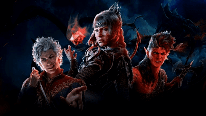
The latter is, of course, complete nonsense. Baldur’s Gate 3 relies on a colorful, but realistic and sometimes dark fantasy look.
But it almost turned out differently. We explain the background to this presumably fateful decision.
Two complete changes of course
Alena Dubrovina worked on Baldur’s Gate 3 as lead character artist and is now art director at Larian. As a guest on the podcast AnsweRED (CD Projekt Red’s in-house podcast), she now talks about how different the original vision for the role-playing game was from the final version.
She reveals that she and her team initially tried out more stylized approaches to the visuals for Baldur’s Gate 3, which made the game look almost like a cartoon.
The search for the best look for the role-playing game proved to be extremely difficult. According to Alena Dubrovina, Larian decided at least twice to completely restart the graphic style.
It wasn’t just a refresh, it was a complete change of direction. […] I remember a conversation with another artist on our team. It had already been six months, and [he] was still working on the heads, and I said, “Yeah, you’re making progress.” Then suddenly it was, “No, that’s not right.” He was already pretty close to his limit.
What if … ?
Time for the elephant in the room: What would have happened if Baldur’s Gate 3 had actually come out with cartoon graphics? Larian gives us a taste of what the game could have looked like in the form of short films on YouTube himself.
Would the role-playing game still have been such a huge success for Larian? Of course, no one can say for sure, but it’s doubtful. Because apart from small indie titles, comic looks are not exactly popular with gamers They often even have a deterrent effect.
There are many examples. The excellently playable Hi-Fi Rush looks like a TV cartoon and therefore does not appeal to the masses. Ubisoft’s 2008 reboot of Prince of Persia fell flat, mainly due to its colorful style. And although the first-person shooter XIII is stylistically unmistakable, it is still considered an insider tip today, partly because of its graphics.
There are also counterexamples:The first Borderlands spent a long time in development with graphics that were as realistic as possible for the time. It was only in the last third of development that Gearbox decided on the now iconic graphic style – and thus laid the foundation for its immense success.
The graphic style of a video game is therefore not a decision that a development team should take lightly. The visuals are the first thing players see of a title. If you scare off potential buyers at that stage, even the best gameplay will struggle to get people talking about your game.
What do you think? Comic graphics: yes, no, or don’t you care as long as the game is good? Let us know in the comments!


